Ads should be things that people see as a benefit…not cringe at with the feeling of being followed. In the spirit of our motto “making ads matter”, our goal is to elevate the quality of display advertising online. So every week we will be doing one ad review of a non-Adacado ad we see online, and provide our critique on the creative execution, targeting, personalization and user experience. We would love to get your feedback as well, so tell us what you think.
We don’t know the inner workings of these campaigns and will essentially be reviewing them as a 3rd party observer, so please add any color or information around the campaign if you have it.
We look forward to working with you to make ads matter.


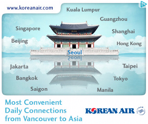
Our very first ad spotlight review features Korean Air ads. I recently did a search for flights on a variety of travel search engines for an upcoming trip to Thailand and afterward encountered two Korean Air ads on CNN.com. See screenshot below.
First, the facts: Korean Air is the largest airline in South Korea with numerous international flights daily. From what I could garner, the ads were served as part of an awareness campaign via Simpli.fy (a DSP), in a 300×250 and 728×90 format.
How'd They Do?
The audience targeting on the media buy was successful, as I was clearly in the market for a flight to Asia. They also did well with location specific creative, as the ads correctly used Vancouver as my departure city.
Opportunities for Improvement
Missing Border:
I was surprised the ads did not have a 1px border around the edges, which is a requirement with most DSPs and exchanges. Having a border would help contain the ad elements, which seemed to be floating off into the white background of the page.
Missing Call To Action:
We know from experience that having a clear Calls-To-Action (CTA) button improves performance.
Image Relevance:
A mismatch on the 728×90 occurs between image (showing world landmarks) and the personalized message “from Vancouver to Asia” clearly meant for only Asian destinations.
No Follow up:
I clicked the ad and visited the Korean Air site, but never saw any further ads targeting me to come back, which seems like a missed opportunity to engage a potential client.
Overall, a pretty good execution, but still some room for improvement with a few enhancements on the creative approach.


