Ads should be things that people see as a benefit…not cringe at with the feeling of being followed. In the spirit of our motto “making ads matter”, our goal is to elevate the quality of display advertising online. So every week we will be doing one ad review of a non-Adacado ad we see online, and provide our critique on the creative execution, targeting, personalization and user experience. We would love to get your feedback as well, so tell us what you think.
We don’t know the inner workings of these campaigns and will essentially be reviewing them as a 3rd party observer, so please add any color or information around the campaign if you have it.
We look forward to working with you to make ads matter.




I’m in the market for a car and had narrowed it down to two car companies. In the midst of my online research on these companies I was targeted with relevant ads by a 3rd company. Infiniti digital ads were pertinent to my research so I thought they would make a good review.
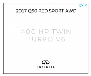
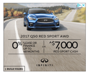
Infiniti is the luxury brand of cars under the Nissan umbrella. While on CNN.com, I saw prospecting ads of theirs in two differents sizes that are featuring financial offers.
How'd They Do? Let's start with the positives
Relevance:
They did a great job targeting the right audience since I am in-market for a similar car and the ads engaged me enough to click through to learn more about their offers.
Media Targeting:
These Infiniti car ads were displayed on relevant contextual pages on a quality publisher, CNN, which further enhanced Inifiniti brand credibility.
Eye-Catching Visuals:
They incorporated impactful animation, especially the transition from the 2nd to the 3rd frame when the car drives forward prior to displaying event details.
Opportunities for Improvement
Difficult to follow:
Messages were hard to follow because of quick frame transitions
Difficult to read:
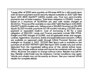
Readability issues on the first frame due to light text color against a white background, on the last frame with small font and the pop-up, is barely legible.
No Strong Call to Action:
Lack of CTAs on most frames; and the CTA on the last frame is barely visible to the user because it blends in the background.
Lack of Personalization:
Considering I was heavily researching sedans, Infiniti could have used that in-market data to further refine the creative with imagery and offers targeted around sedans to make the ad even more relevant for me.
Overall, these were great looking ads that have peaked my interest into the Infinity brand. Well done!
Let us know what you think of these ads? Did they grab your attention? Also, let us know if you have any suggestions on which company’s ads you want us to feature for next week.
